Friday, 30 November 2012

Overview of the Magazine Industry


Major Companies There are a lot of different magazine publishers but the main ones are Bauer, IPC, BBC and National Magazines. These companies are in constant competition with each other but according to the 2008 sales revenue in newsagents, revenue for these magazines looked like this:

1.       Bauer Publishing               25%
2.       IPC Media                           20%
3.       BBC Magazines                  7.8%
4.       National Magazines          7.3%
Size of Industry The magazine industry can be split into four groups; consumer magazines (general and specialist), business magazines, customer magazines and newspaper supplements. Consumer magazines are things that the general public would buy like Empire, NME, OK and Car. Business magazines are published specifically for people in work. They are magazines like Press Gazette and Campaign. Customer magazines are published to give customers of some products and places and are usually free. These can be magazines like Sky TV and Waitrose Food Illustrated. Newspaper supplements are free magazine that come with certain newspapers, for example, the weekly TV listings comes with the Sun. The magazines I’ll be concentrating most on are consumer magazines. At present, in the UK, there are over 3,200 different consumer magazine titles overall, 1.4 billion magazines are sold each year, 85% of the population reads at least one magazine a year, advertisers will spend approximately £745 billion in magazines each year and consumers spend about £2 billion on magazines annually. A lot of new magazines are created (on average 500 a year) however, only 3 out of 10 of these will survive more than four years.
Current Trends Magazines look to give their readers the latest news on the subject the magazine concentrates on. A magazine will be successful if they are “with the times”. This means they will look at social and cultural ideas of today and may even challenge them. Moreover, they would introduce different ideas to their readers, even if some of them could disagree. Magazines will also look to different types of technology, for example, websites. A lot of magazines will have a website now in comparison to twenty years ago because of technology development. Magazines are also started to make their magazines a lot less text based and more image based.
Impact of Technology Technology has had a huge impact on the magazine industry; now a magazine can have a radio station, a website, a TV channel and Podcasts. A magazine having any of these things can also be a sign of how successful they have been with their magazines. They are able to expand the things they print to other forms of media. Also, you can purchase magazines to read on a tablet or an E-Book reader, so a person doesn’t have to go out and buy the magazine; the industry has been completely paper based until now.

Wednesday, 7 November 2012

Advertisers Moodboard and Analysis

This moodboard represents the companies that are likely to advertise in my music magazine. My target audience are going to be young (about 15-25), mainly male (but some will be female) and artistic. They’ll favour the rock genre of music and they’ll probably be very individualistic.

Because the magazine is a music magazine, HMV is going to want to advertise in any music magazine. Plus, all the music festivals such as Reading and Leeds and Download will want to advertise in the music magazine because people buying a rock music magazine will want to go to a rock music festival. Moreover, I have included Q which is another music magazine, Aloud.com which is a place where you can buy concert tickets and Live Music Management which is a concert organiser. Also, Fender and Epiphone sell guitars and basses and so would want to advertise because of the genre of music my magazine is going to be about and Orange produces amps and they would want to advertise in the magazine because of the same reason as Fender and Epiphone. Furthermore, my target audience are going to have quite a lot of money and therefore will be able to afford the highest priced gadgets, for example, Apple. Apple also has iTunes which a lot of my target audience would be interested in so Apple would want to advertise in my magazine. Finally, Play.com, Amazon and eBay all sell music and CDs so they will be interested in advertising in the music magazine.

My target audience are going to be interested in the latest phones and gadgets which is why I’ve put Blackberry on my moodboard. Plus it’s branded which people always look out for. For this reason, I have put Sony and Dell on the moodboard. Additionally, O2 and Vodafone are on here because they organise gigs and festivals and also because they’re phone networks. Because my target audience are young they’ll have mobiles and so O2 and Vodafone will advertise in the magazine. Relentless also sponsor and organise festivals as well as being an energy drink that’s regularly bought by teenagers and younger people. Not only would my target audience be interested in the latest gadgets, but they’d enjoy doing creative things, like photography which is why Nikon would advertise in my magazine.

My target audience are going to want to watch a little bit of TV and they would probably be most interested in programs on E4, like Misfits, which are aimed at young people.

My target audience are going to be mainly be male with some female which is why I’ve added the Playstation 3 and the Xbox 360 because a lot of my audience will play them. Also they’ll like Nintendo because it’s a gaming company.

Finally, my target audinece will wear branded products like Vans and Converse because of their youth and they won’t eat healthily because they’re young and won’t be bothered about cooking food. This is why Starbucks and Subway are on my moodboard.

Font Moodboard and Analysis

These are the ideas of the fonts I will use on my front cover and throughout the rest of my magazine. They are all in the style of the possible name for my magazine, 'Encore'.

I’ve gone for more heavy, bolded fonts because I want the text to stand out against everything else in the background. There are a couple of exceptions, but they will probably be looked at for coverlines, pull quotes, etc. I’ve used ones that look like they’ve been eroded slightly because it gives a street vibe, and the idea that they haven’t been taken care of, so they’ve been scratched up a lot. Plus, one looks like it’s been smashed which reminds me of the masthead for Kerrang! which would add to the theme of rock in my magazine. Plus, there are fonts on the moodboard that connotes youth like the one that’s typically used on college jackets. It’s implies that my target audience are young. Moreover, I have used fonts that look like they’re been hand drawn or written which gives the idea of comfort and familiarity. Furthermore, I have added fonts that look very modern. This is because I will be putting newer music in this magazine.

Out of all these fonts, my favourite is the one on the left hand side, forth from the top. This is because it’s bold and a little faded at the bottom. I also think that from afar, where the text has been eroded it looks a little like the shape of the crowd at a live show.

Colour Moodboard and Analysis

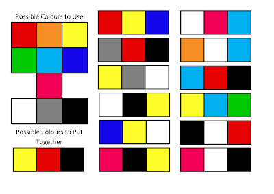
These are the colours that I am thinking about using on the cover and throughout my music magazine.

I have used a range of dark and light colours in the moodboard because although the music I’m featuring in my magazine is dark, I also want my magazine to be fun and even a little childish which is why I have used a range of colours. I have also used a lot of black, white and grey to connote the seriousness of music and how serious people and the bands take music. In relation, I have used red which connotes passion which also shows the passion the readers have for music. The blue connotes calm and a lot of different colours are able to stand out on blue, especially light blue which is why it’s a main feature on the moodboard. Yellow is like light blue in the way that a lot of colours can be on top of it and it will still stand out. Pink, orange and green were colours that I found on some magazines that are like the one I’m going to make. I liked how the colours went on the magazine so I decided that I should use some of them as well.

Target Audience Moodboard and Analysis

This moodboard represents the target audience of the magazine I am going to make.

My readers will definitely have a passion for music, and more specifically, rock music, which is why I have put the guitar and the drum kit on the board; a lot of my audience will know how to play an instrument and/or may be in a band. Moreover, they will own a lot of CDs, listen to as well as play a lot of music and will go to a lot of gigs and live shows.

Additionally, the audience will have a creative side which is why I have added the picture of the camera, the books and the website logo for DeviantArt because if they don’t play an instrument, they’ll enjoy doing other creative things like art. Plus, my audience are going to be into gaming (old and new games) which is why the Game Boy is on the moodboard along with the Xbox. The preferred sport of my target audience is probably going to be skateboarding and the majority will like superheroes and therefore, they’ll read Marvel and DC comics.

My audience are going to be young, so they would like to have the latest technologies, like the iPhone and an expensive laptop along with watching a fair bit of television. They will also go on social networking websites such as MySpace, Facebook and Twitter. Plus, my audience won’t be too concerned with clothes, but they will like to wear Converse. Furthermore, they will like drinking coffee, which is why the Starbucks cup is on the board and they’ll be young, so will be at parties and probably drink a lot of alcohol, hence the Strongbow. I’ve also implied youth with the moodboard through the junk food featured on it and the individuality of dyed hair, tattoos and piercings. My audience are going to have a lot of these because of the genre of music my magazine is going to feature.

The people who will read my magazine probably aren’t going to be religious as represented by the upside-down cross. Religion just isn’t going to be a big part of their life because a lot of the people I’m targeting would regard music as their religion. Finally, my audience are going to be passionate about certain causes, as I’ve represented through the campaign of ‘Ink not mink’ which is the idea against making and wearing animal fur coats. A lot of my audience are going to relate to and/or want to help certain charities that could be close to them.

From this, I have shown that my target audience are going to be young, mainly male (but some will be female) and artistic. They’ll favour the rock genre of music and they’ll probably be very individualistic.