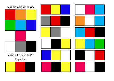
These
are the colours that I am thinking about using on the cover and throughout my
music magazine.
I
have used a range of dark and light colours in the moodboard because although
the music I’m featuring in my magazine is dark, I also want my magazine to be
fun and even a little childish which is why I have used a range of colours. I
have also used a lot of black, white and grey to connote the seriousness of
music and how serious people and the bands take music. In relation, I have used
red which connotes passion which also shows the passion the readers have for
music. The blue connotes calm and a lot of different colours are able to stand
out on blue, especially light blue which is why it’s a main feature on the
moodboard. Yellow is like light blue in the way that a lot of colours can be on
top of it and it will still stand out. Pink,
orange and green were colours that I found on some magazines that are like the
one I’m going to make. I liked how the colours went on the magazine so I
decided that I should use some of them as well.

No comments:
Post a Comment